A mobile app that fosters genuine conversations by teaching communication skills. It provides users with practical exercises and real-time feedback to enhance their interactions.
A guiding quote for our research
-Marvin J. Ashton
We decided to focus on bridging generations and fostering connections between people from different generations or cultures. Recognizing that feeling connected with someone from another generation or culture can be life-changing, we aimed to create a solution tailored to facilitate these interactions. Our research led us to explore how a digital tool could effectively help connect people across generational and cultural divides.
90% of parents struggle to communicate meaningfully with their child.
9 out of 10 people admit to downplaying their emotions so they won’t worry or burden a loved one.
-OnePoll
By leveraging these insights, we aimed to design a system that focuses on fostering meaningful connections and bridges generational gaps.
Following a comprehensive market analysis, we identified existing apps that focus on fostering intergenerational communication and promoting healthy communication habits to guide our process. Here is the list:
After compiling these results, we brainstormed different solutions (seen below) that current apps do not address.
extranotes.png)
Here we compiled a list of different features we should prioritize when designing our app.
Here we voted on various "How Might We..."s to determine our user's needs.
User Interviews
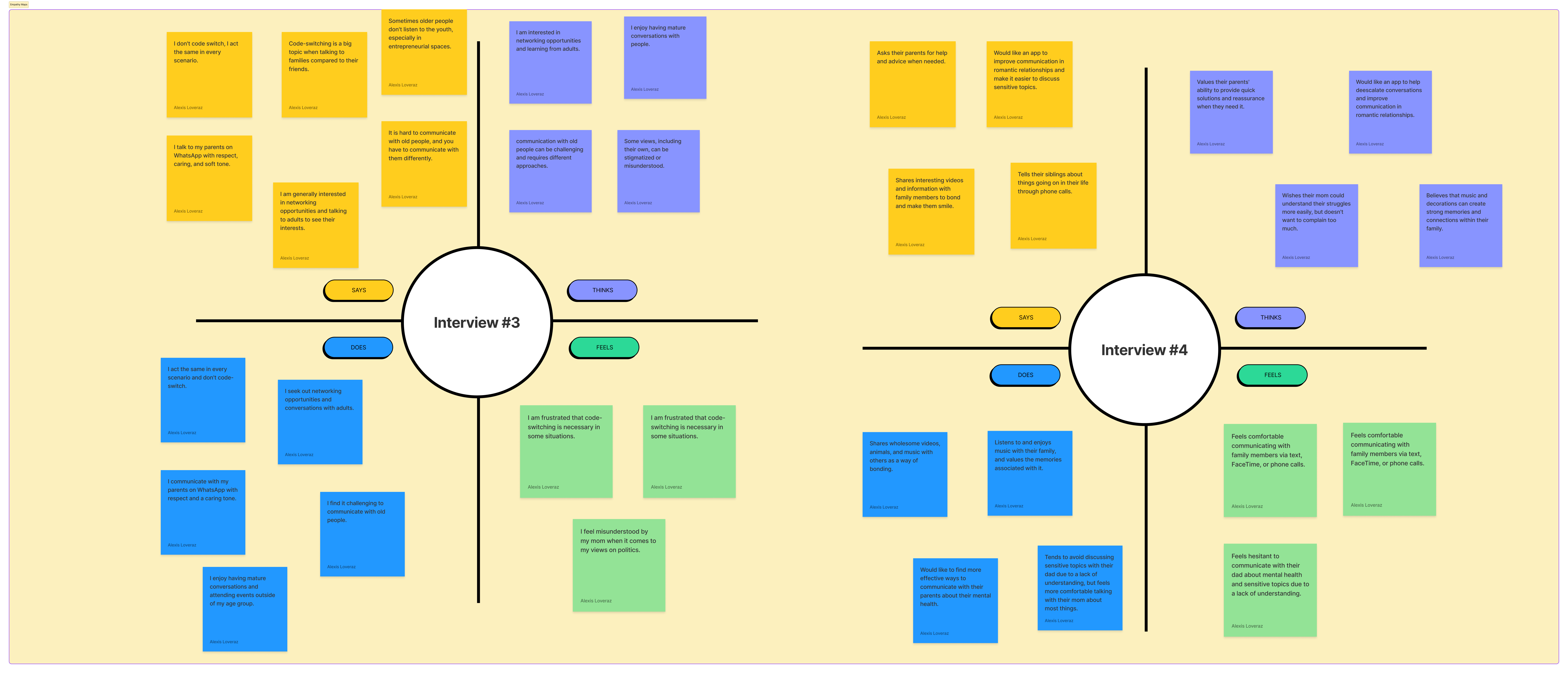
User Personas
Age: 54 years old
He loves to check in and talk to his daugther who is a freshman at college. But he always feels like he says the wrong thing. He wishes there was a way for him to know how she is feeling.
Age: 20 years old
Due to her busy schedule, she is rarely able to call her parents consistently. Although she thinks her parents provide her with good advice, like with finances, she hesitates to share personal details and yearns for them to understand her better.
Journey Map
User action
student wakes up gets ready for the day
mom calls the student
student is busy declines the call and texts them instead
student goes to class
mom goes to work
student goes to study in the library and finishes their homework
student goes to study in the Stacks and finishes their homework
student is upset mom did not answer them and starts their night routine
mom sees her daughter's text, gets concerned and calls her daughter multiple times
both mom and student go to bed not talking to each other
daughter is awoken by the several calls and angrily tells her mom that she is tired and will talk to her later
feeling sad because daughter did not answer call
feeling annoyed because mom did not remember their schedule and interrupted their morning routine
daughter feeling sad because mom did not answer call
mom feels guilty because she ignored her daughter's call
mom is feeling anxious due to her daughter's text
Experiences
Ethical Considerations
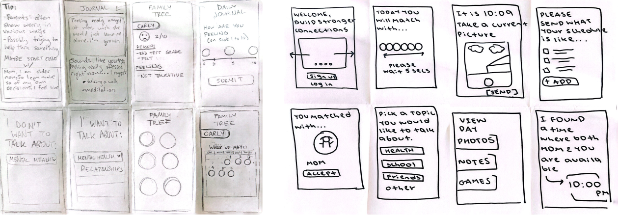
These sketches lead us to main features that we includes in the final working prototype.
These wireframes helped us tailor down what features were key and start focusing on our app's user interface.
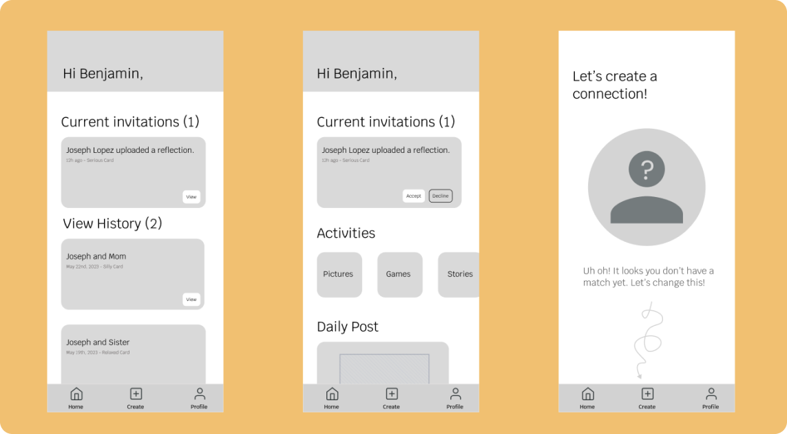
We were exploring if we wanted the homepage to look more like a dashboard or if we wanted to focus on the person that they are connecting since the main focus of our app is to create meaningful connections with people that you are.
Many users preferred if it was looking at one person for the homepage since it would be overwhelming to have multiple personas on the screen. Also users thought they would not look at their past connections frequently enough to warrant it being on the homepage, and suggested it be on in another section of app like the profile section.
We were exploring if we wanted the homepage to look emulate a dashboard or if we wanted to focus on the person that they are connecting since the app main focus is to create meaningful connections with people close to you.
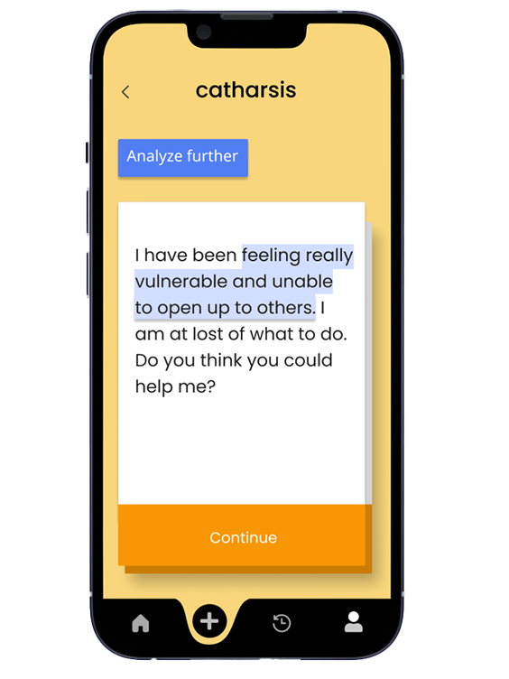
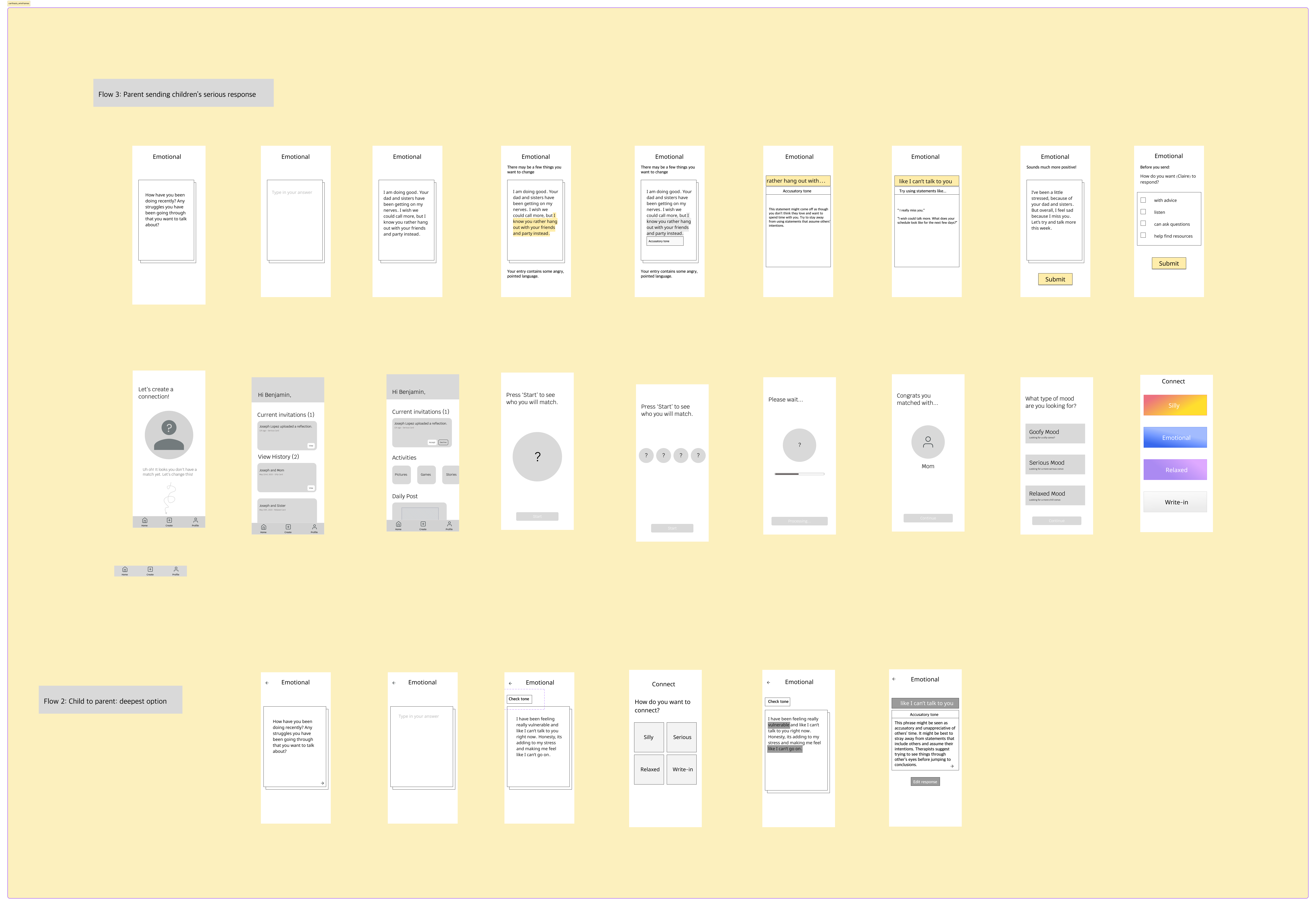
Many users liked the check tone feature and how specific phrases were highlighted. They also enjoyed the ability to edit their response after being given a thorough description of how their response could unhelpful and/or harmful. Users commented that they would most likely gravitate towards the serious cards the most, as they did not feel a sense of disconnection with their relatives around silly and relaxed topics.
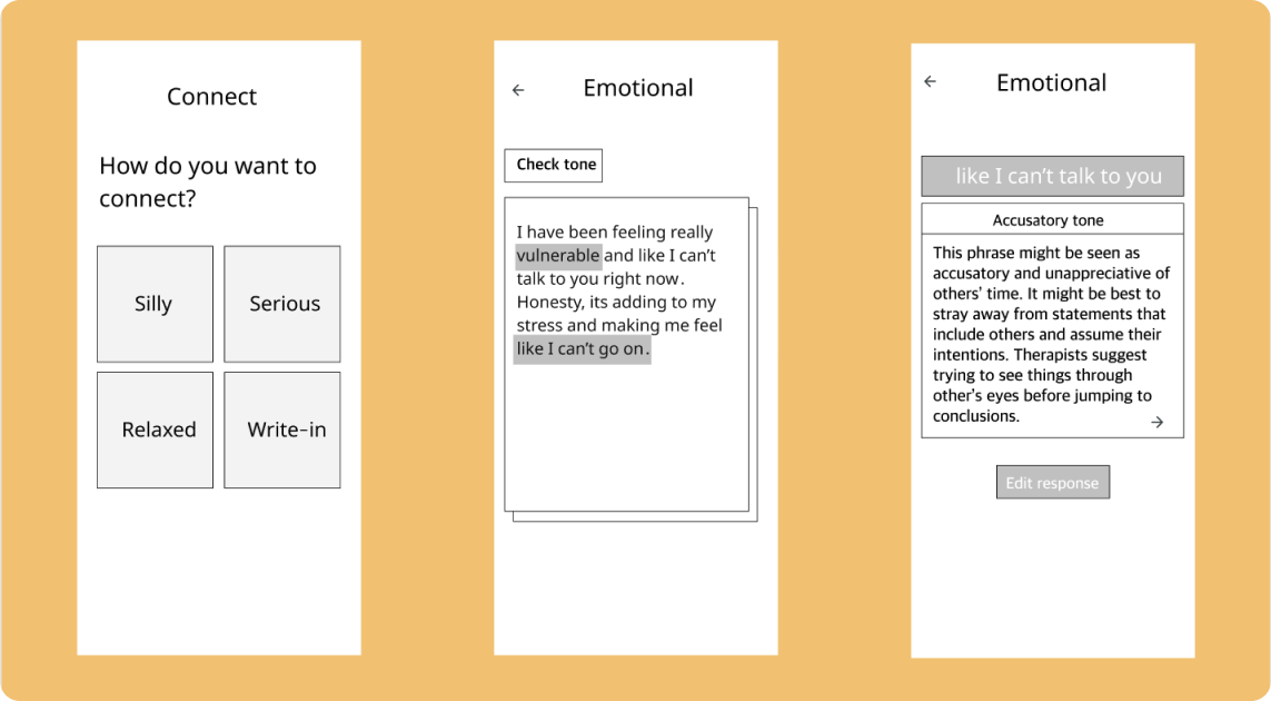
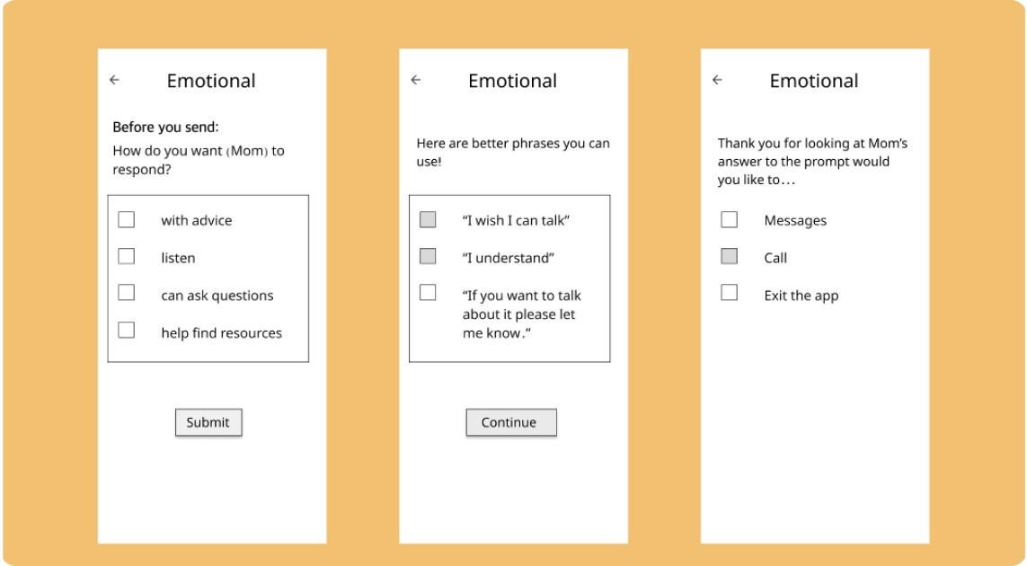
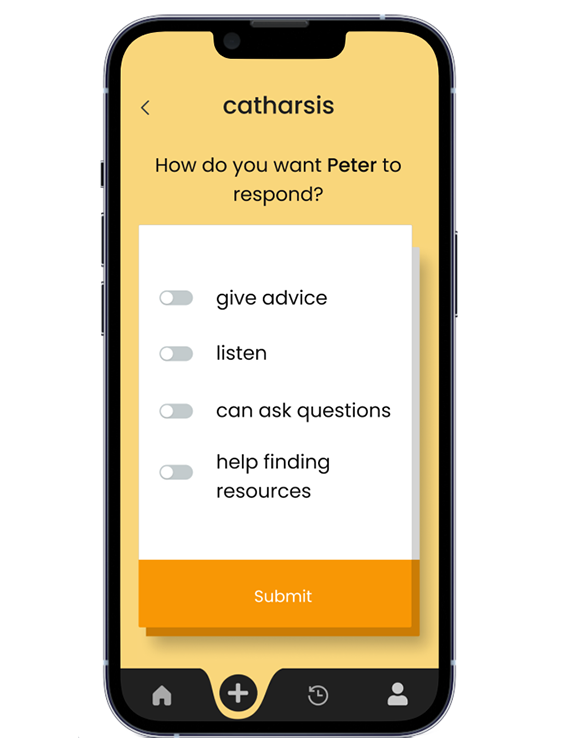
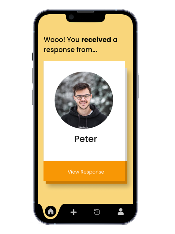
After completing the prompt you fill out how you want the other person to respond to you. Whether its giving advice or asking questions, you can then look at their response and at the end have the opportunity to chat or call with them.
Many users enjoyed the feature of listing how the other person should respond, how it acted as more of a conversation-starter, and how the real conversation started with a phone call or text message instead of staying on the app.
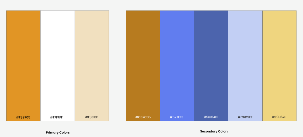
Our color palette’s primary colors consist of white, a pale yellow-orange, and bright orange to create a clean aesthetic and a space that encouraged confidence. The secondary colors includes blues and vibrant yellows. These colors added helpful balance the page and bring about a tranquil vibe.
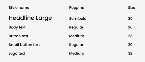
We used the Poppins font, because we wanted our app to create a safe space where individuals feel comfortable discussing difficult topics. This font is informal, so people can fully open up nad not feel like they have to act a certain way. Also we used the Poppins font, because it is minimalistic and won’t visually overwhelm the user who may already be feeling vulnerable.
After presenting our lo-fi prototypes to users and analyzing their feedback, we iterated, implemented key changes, and were able to produce high fidelity prototypes that aligned with our app's main mission.
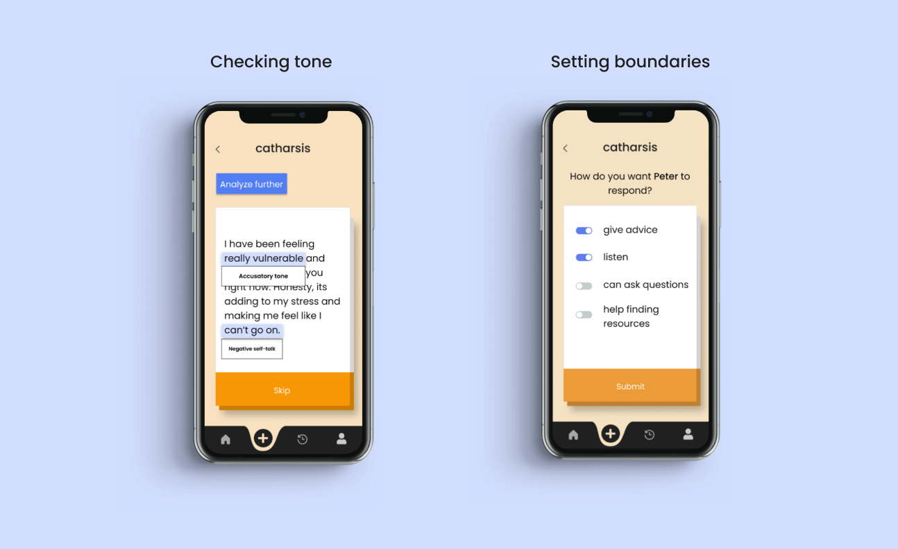
Our top priority was to create a safe space for users. The app highlights sections of a user’s response that may be misconstrued or are unhelpful and provides examples of how to communicate more effectively. Users can check off specific topics they are comfortable or uncomfortable discussing, which helps set clear boundaries and ensures conversations remain respectful.
Additionally, the app offers practical tips to improve communication, fostering more empathetic interactions. By prioritizing these aspects, we aim to create an environment for meaningful and constructive dialogues, ultimately enhancing communication skills and strengthening relationships.
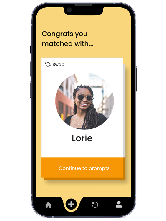
The app pairs users with a random member of their community, facilitating connections with new people. One of the key features, ‘Swap,’ allows users to change their match of the day. This flexibility is crucial as our user research revealed that people often appreciate the option to choose a different match if they feel the initial one is not suitable. This feature enhances user satisfaction by giving them control over their interactions and ensuring they engage in conversations that are more likely to be meaningful and enjoyable. By incorporating this user-driven flexibility, the app promotes more positive and fruitful connections within the community.
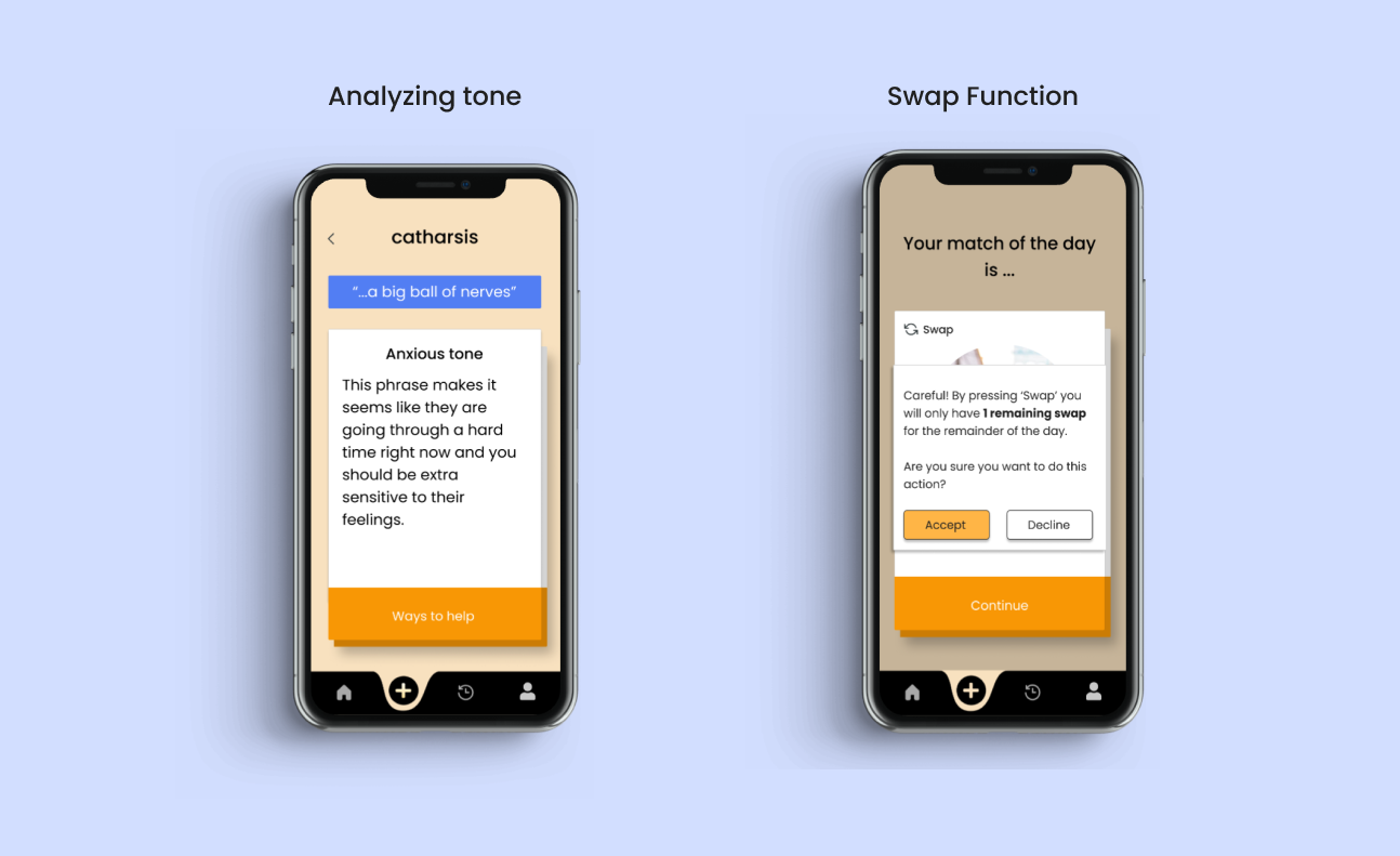
During user interviews, we found that engaging with individuals from diverse backgrounds led to our best designs. By interviewing random participants in the library, we expanded our user scope, resulting in an intuitive app for all users. Initially, we aimed to connect different generations within the same career field, but user research revealed a greater need for intergenerational connections within personal circles. This pivot led to an app with a stronger emotional impact. Throughout the process, we drew inspiration from user research, various apps, and even a Grammarly ad, which influenced our tone-check feature.
To enhance the app's functionality and user experience, we plan to integrate self-written prompts, allowing users to create personalized conversation starters that resonate with their unique relationships. Additionally, we will incorporate in-app messaging for seamless, immediate communication within the app. Finally, we aim to include more interactive connection methods, such as shared activities and games, to foster deeper engagement and strengthen relationships through fun and meaningful experiences.