
A secondhand e-commerce app for Dartmouth students to list and buy items (ranging from clothes to textbooks) from each other, allowing them to update their wardrobes and get rid of clothes they no longer wear during the term.
-Sam Walton (Quote to inspire our research)
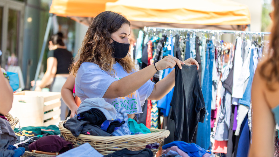
Source: https://news.miami.edu/stories/2021/09/campus-community-gives-clothes-a-second-life.html
We decided to focus on the struggles students face with decluttering their spaces and sourcing affordable items quickly from other students. Recognizing the importance of a clean and organized living environment for academic success and mental well-being, we aimed to create a solution tailored to their needs. Our research led us to explore popular secondhand e-commerce apps, which have gained significant traction among younger demographics.
90% of Depop's active users are under the age of 26.
-Insider
64%of college students are eager to start their own business.
-Entrepreneurial
By leveraging these insights, we aimed to design a system that facilitates decluttering and promotes sustainable consumption and entrepreneurship.
After a thorough analysis of the current market, we came up with 6 current apps that would guide our process. Here is the list.
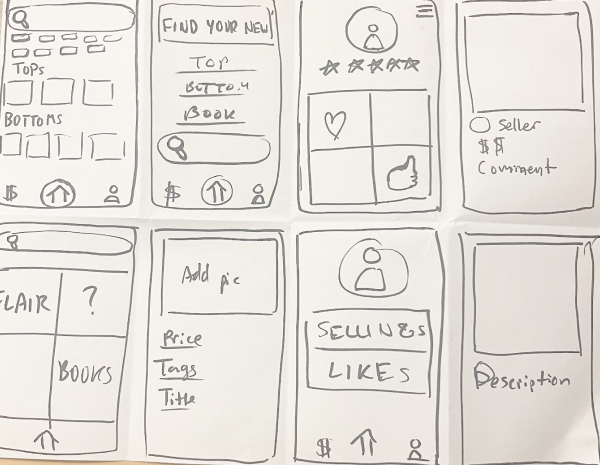
After compiling these results, we brainstormed different solutions (seen below) that current apps do not address.
.png)
Here we compiled a list of problems and features we should prioritize.
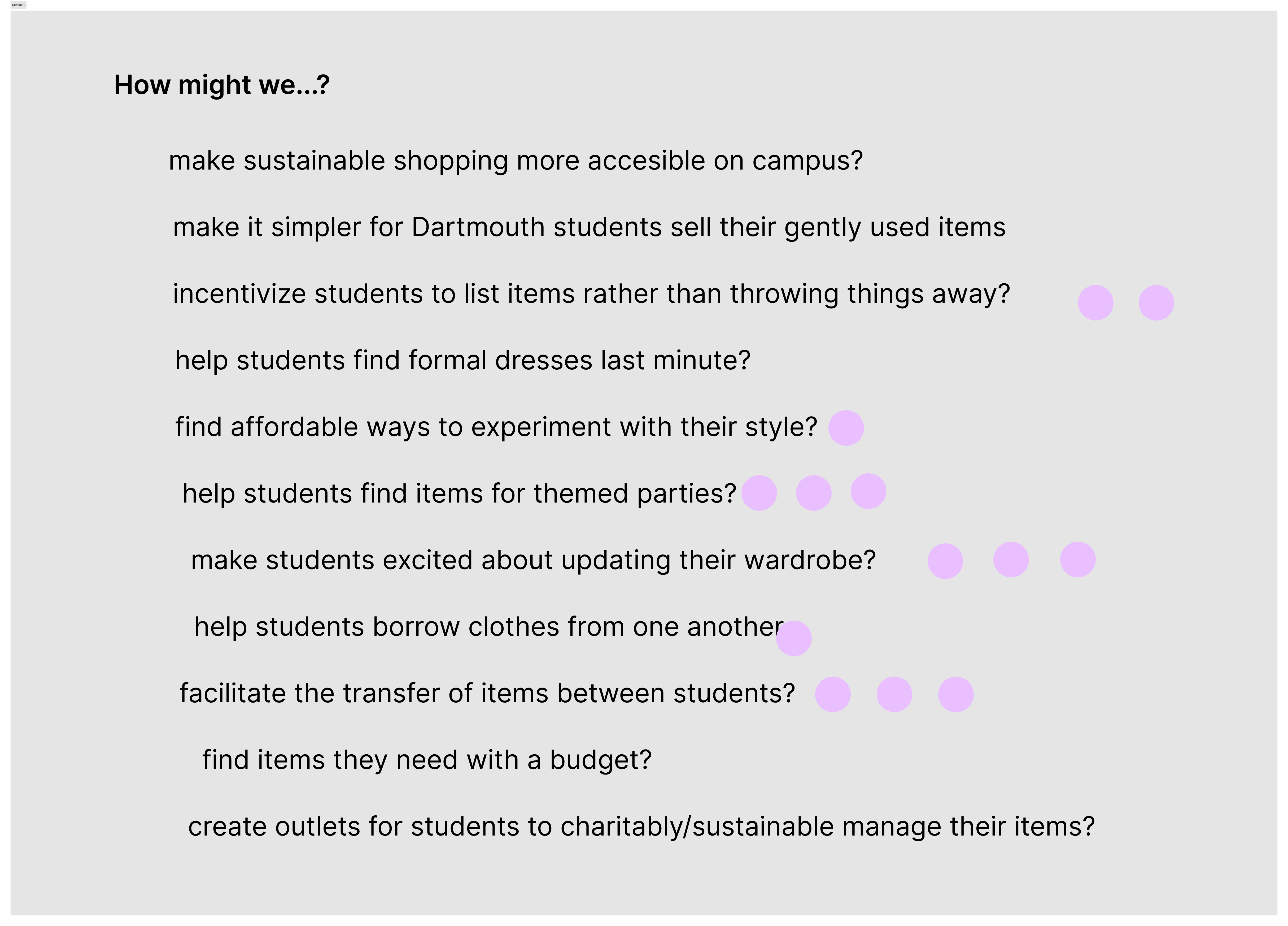
Here we voted on various "How Might We..."s to determine our user's needs.
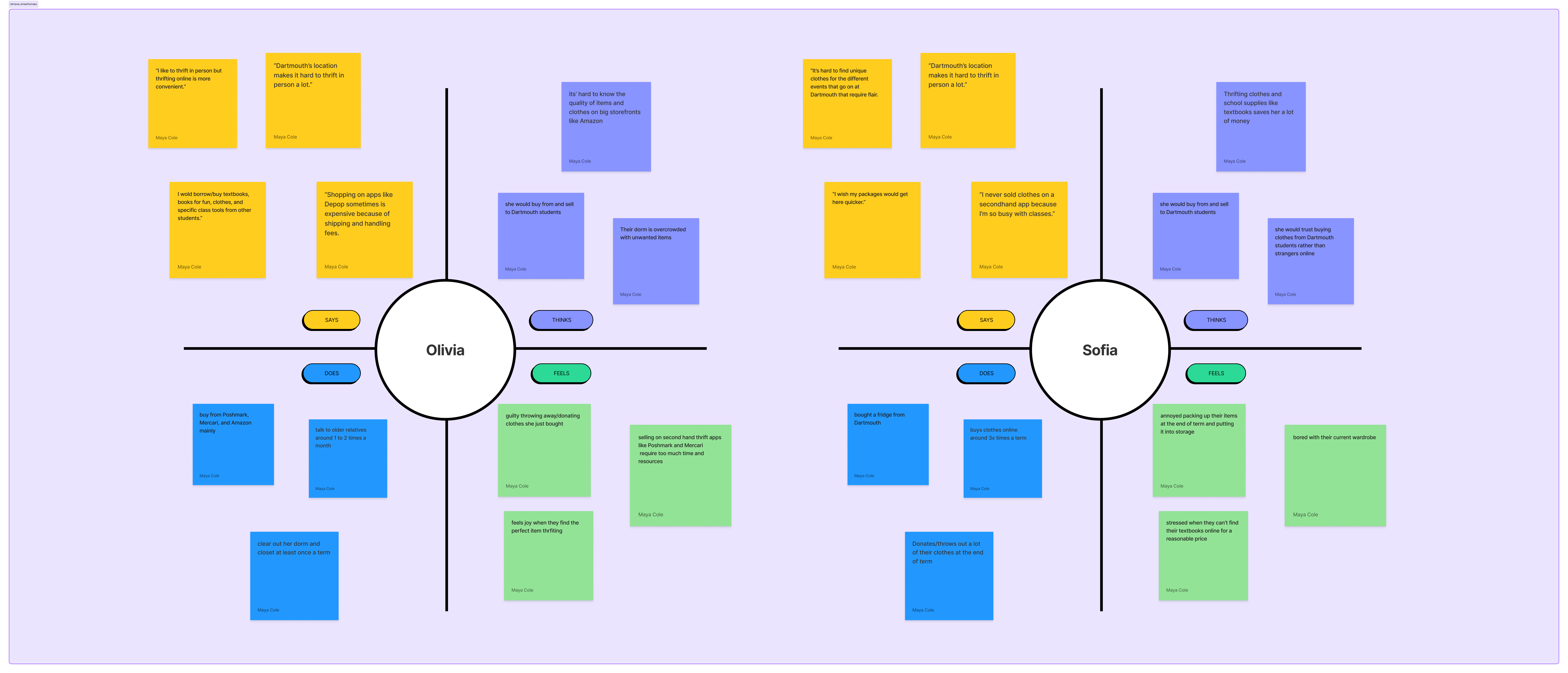
Age: 20 years old
She is very fashionable is moving out next term and wants to sell her belongings. She is very busy and doesn’t have time to go to the post office and ship her items out. She wishes there was a way to easily sell her stuff to students near her.
Age: 18 years old
He just moved into his dorm and realized he forgot to buy some essentials. He knows if he orders off an e-commerce site now it will take a while for him to get these essentials and probably will be upcharged due to the start of the school year.
User action
first-year student searches needs new clothes for the start of school year
they go on their phone and search different secondhand apps like Depop and ThredUp
after searching multiple sites and comparing prices the student has to stop and go to class
students messages the seller to find out when their top will be shipped
student receives email that their package is here, goes to the on campus package, and has to wait in a 30 minute line
student gets their package, tries on their top, and determines they don’t like the fit or quality of the product
although the student does not like the top, she decides not to return it as the return process is too time-consuming
feeling excited to update their wardrobe
the student is slightly fatigued after having to search multiple sites
the student got a burst of adrenaline from buying the top and is delighted to receive their top
student was irritated that she had to wait in the line
student left sad after not being satisfied with their purchase
Experiences
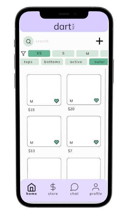
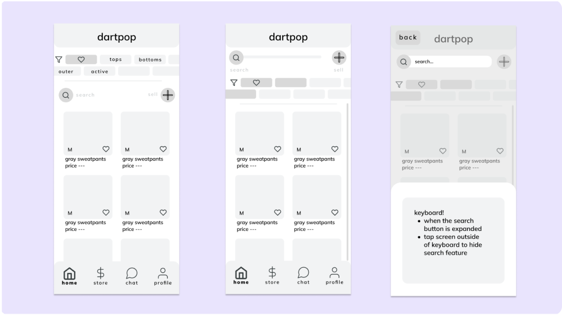
We aim to cater to both students interested in selling items and those looking to purchase items from fellow students.
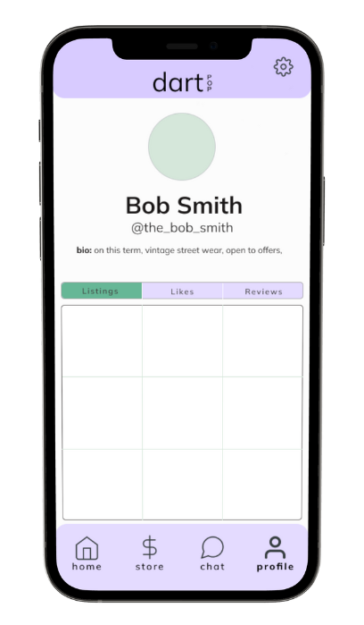
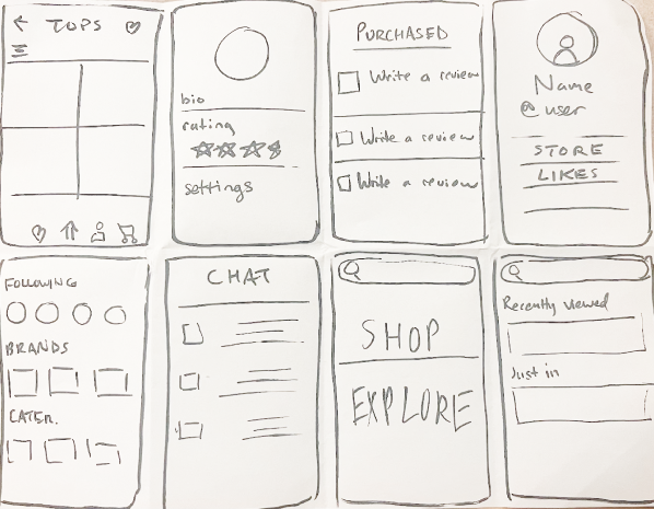
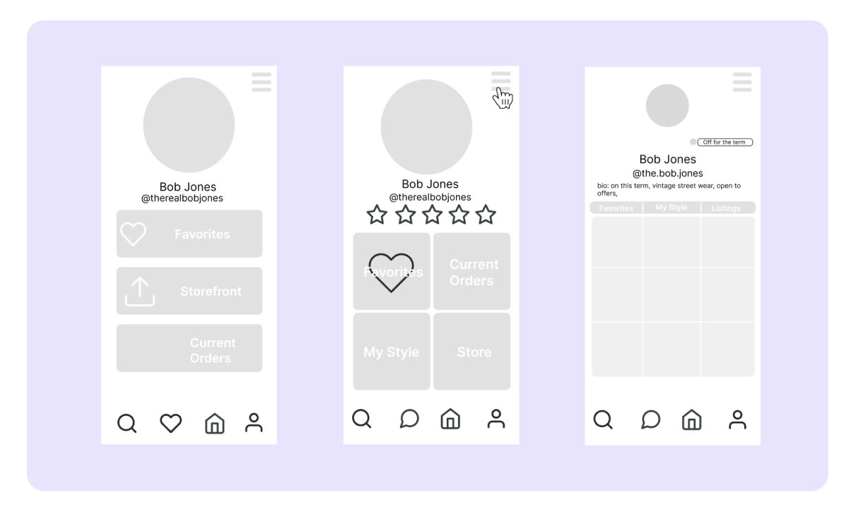
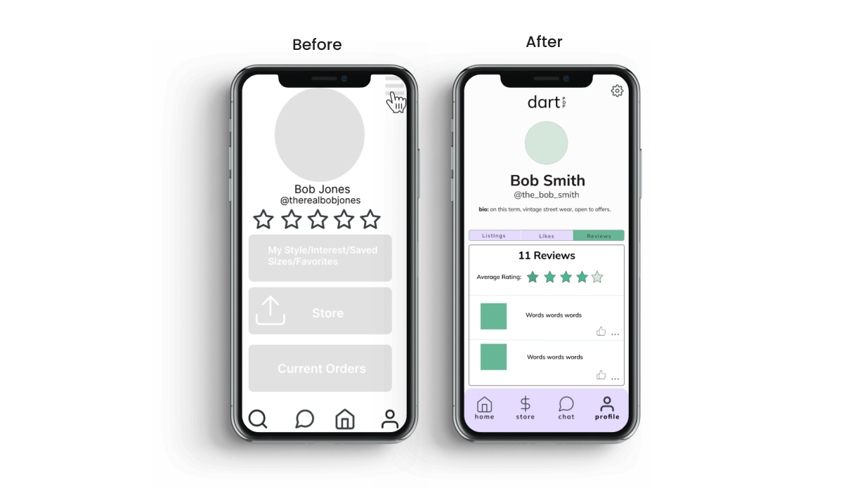
We wanted the profile page to have 3 core features. The user’s listings, their likes, and their reviews. We also wanted to include a bio and profile picture so users can personalize their account.
Many users enjoyed the profile section being separated into three different sections with a scrollable image grid the best. They also felt the profile photo should be smaller and they wanted their reviews to not be directly under their name but rather incorporated into the image grid. We wanted the profile page to have 3 core features. The user’s listings, their likes, and their reviews. We also wanted to include a bio and profile picture so users can personalize their account.
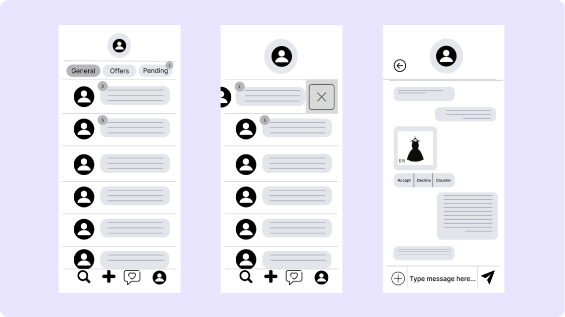
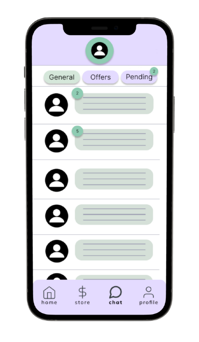
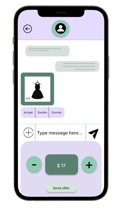
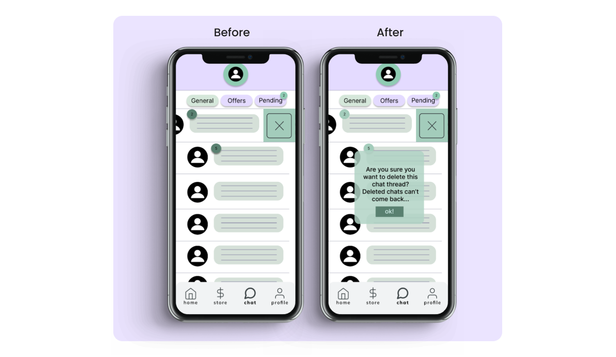
After clicking into an item, students can message each other to discuss the price of their item and ask the seller any questions they have. If students are no longer interested in buying an item, they can delete the conversation.
Many users enjoyed the chat feature as is. They did comment about it was easy for them to accidentally a delete and would like a pop-up to appear before the conversation was deleted.
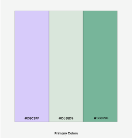
Our color palette's primary colors consist of light green, lilac, and mint green to create feelings of joy and peace. We deliberately chose a pastel color palette to promote feelings of tranquility. As online shopping can be a stressful experience, we wanted these colors to act as destressers for our users.
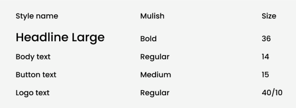
We used the Mulish font, because we wanted our app to be playful and youthful. Our primary user base is college students, we wanted our font to reflect their spark. Furthermore, the Mulish font is sans serif to make the app easily readable.
Our primary goal for this app was to make this app as intuitive as possible. We used key user interface decisions, such as visual hierarchy, iconography, and interaction design for a youthful and ideal experience.
We wanted to simplify the profile page. After conducting user testing, we received feedback that the profile page was too crowded and confusing. We adjusted our three buttons into three by three image grid. To alleviate the overcrowding, we shifted the the user’s star rating to the grid, where potential buyers could scroll their past buyer’s reviews and can sort them by most helpful, least helpful, ascending or descending chronological order.
Building on user findings, we added an overlay that prompts users with a warning message when they swipe right on a conversation. This overlay informs users that once a conversation is deleted, it cannot be recovered, ensuring they are fully aware of the permanence of this action. This feature was implemented to prevent accidental deletions and to provide users with an additional layer of security and assurance, addressing their concerns about losing important communication history. By adding this overlay, we aim to enhance the user experience by providing clear and critical information at the moment it is needed most.
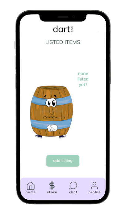
Throughout our project, the most positive feedback we received was for our simplified designs, which helped us refocus on ease of use. What made our application unique was its focus on Dartmouth students, incorporating small details like the unofficial Keggy the Keg mascot and the flair tag, a term for extravagant clothing. We held bi-weekly meetings to ensure cohesive app flow.
For future iterations of Dartpop, we want to build on the various tags we have and possibly expand the chat section to have a built-in map where sellers and buyers can precisely pin where they want to meet up to conduct a sale.